Which Weather API Is Most Accurate?

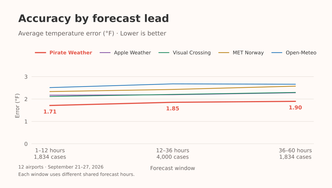
Pirate Weather was the most accurate API for next-day temperature in this test, with an average error of 1.85°F across 12 airports.
88.3% of its matched forecasts were within 3.6°F of the observed temperature.
I build Weather Extension, which lets people choose their weather provider. I saved forecasts from six APIs twice a day for a week, then checked them against public airport observations.
Pirate Weather led overall, but the winner changed by location. Visual Crossing led at JFK, LAX, and Tokyo Haneda. MET Norway led at Toronto, and Open-Meteo led at London Heathrow.
You can explore the results in the interactive API comparison.
What I Tested
The study covered September 21–27, 2026. All 14 scheduled captures ran, collecting 867 forecasts.
The five global providers were Visual Crossing, Pirate Weather, Open-Meteo, MET Norway, and Apple Weather through WeatherKit. I also tested the National Weather Service at the two U.S. airports. These were the six sources already integrated into Weather Extension.
The locations were New York JFK, Los Angeles LAX, Toronto Pearson, London Heathrow, Paris Charles de Gaulle, Rome Fiumicino, Dubai International, Singapore Changi, Tokyo Haneda, Sydney, Rio de Janeiro Galeão, and Cape Town International.
I chose airports because they have public weather observations with station IDs and timestamps. An airport result is useful for comparison, but it doesn’t tell us exactly what happened in every neighborhood nearby.
This wasn’t a test of every weather API. OpenWeather, WeatherAPI.com, Weatherbit, Tomorrow.io, Google Weather, and Xweather weren’t in the collection.
How I Compared the Data
First, I saved the forecasts each API returned. That gave me a record of what it predicted before the weather happened.
Then I collected the weather reported at each airport through NOAA’s Aviation Weather Center. Those station reports were the reference for the comparison. I matched each forecast hour to the closest report from the same airport within 30 minutes. If two reports were equally close, I used the later one. A forecast had to arrive at least an hour before the observation to count.
I checked the temperature and wind readings against the raw METAR report, used the latest retrieved corrections, and left missing readings out. Forecasts and observations stayed at their original times; I didn’t fill gaps between them.
For each comparison, every API was scored on the same airports, forecast hours, and observations. That keeps the scores comparable. The main chart uses forecasts received 12–36 hours before their valid hour, which I call “next-day” here. The NWS comparison uses JFK and LAX, with all six APIs scored on those two airports.
I measured temperature and wind speed separately. The average error is mean absolute error, or MAE. If a provider is 2°F too warm for one hour and 2°F too cool for another, its MAE is 2°F. The errors count by their size and don’t cancel each other out. Lower is better.
The interactive comparison also shows how often forecasts were within 3.6°F for temperature or 2 m/s (about 4.47 mph) for wind. Higher percentages mean more forecasts were close within that range. Switching units keeps the same threshold and the same forecasts. The “90% within” column shows the error range that covered at least 90% of the matched forecasts, giving you another way to judge what the average means.
Which API Was Most Accurate?
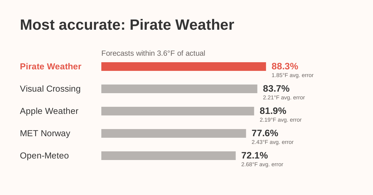
Pirate Weather ranked first on both measures: the lowest average error and the highest share within 3.6°F. Visual Crossing ranked second by that percentage. By average error, Apple Weather and Visual Crossing were almost tied for second, followed by MET Norway and Open-Meteo. All five APIs were scored on the same 4,000 matched forecast hours.
Apple Weather and Visual Crossing were separated by less than 0.02°F in the unrounded averages. I wouldn’t choose an API based on that gap. Features, cost, and the places your users care about are more useful deciding factors at that point.
There’s another detail behind the large case count: those 4,000 forecast cases use 2,144 distinct airport observations. Some forecasts overlap and predict the same future hour. They aren’t 4,000 independent weather events.
Location Changed the Result
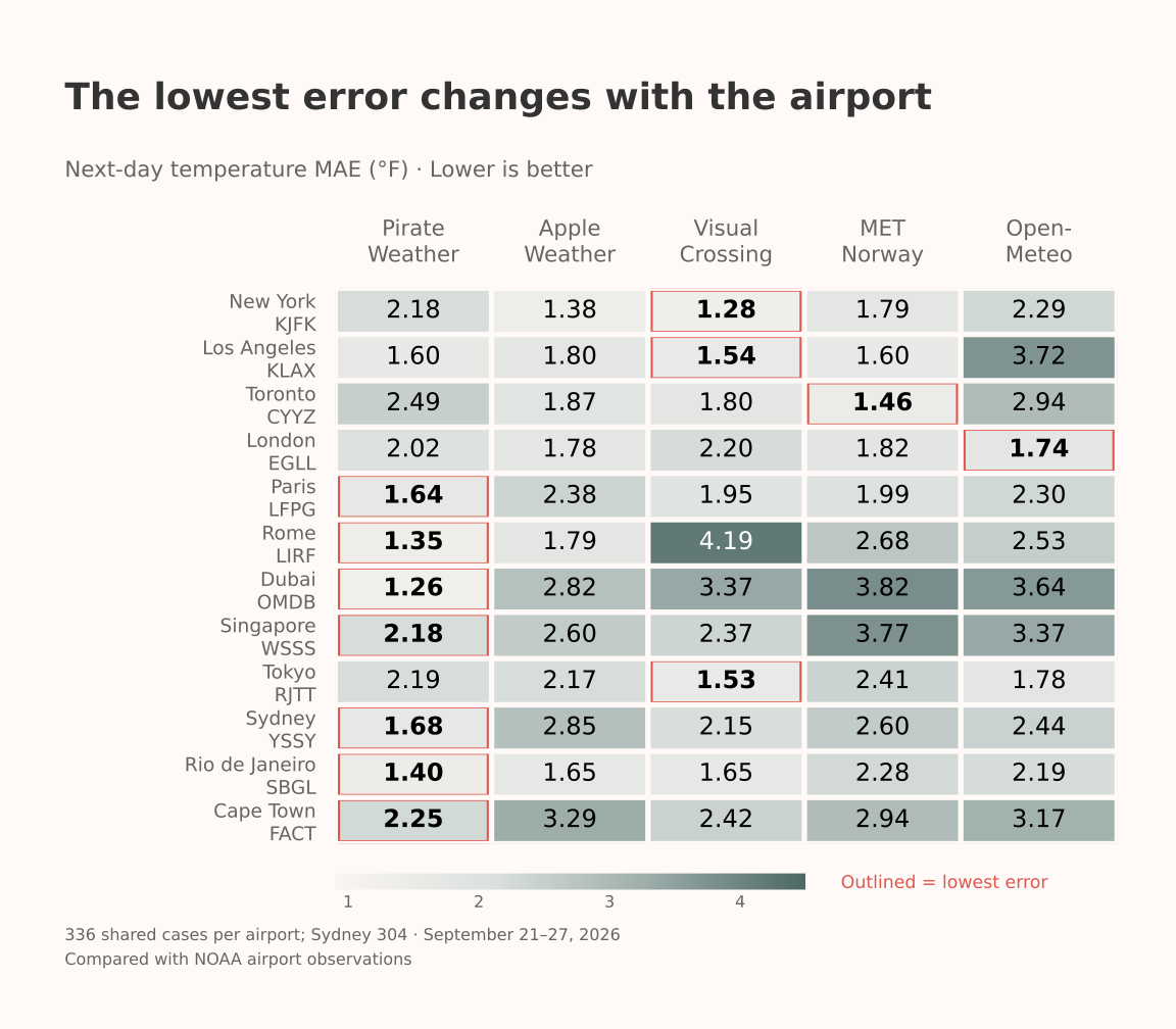
Visual Crossing averaged 1.28°F at JFK, 1.54°F at LAX, and 1.53°F at Haneda. MET Norway averaged 1.46°F at Toronto. Open-Meteo averaged 1.74°F at Heathrow.
Pirate Weather had the lowest average at the other seven airports. Its result at Dubai stood out: 1.26°F, compared with 2.82°F for the next-lowest provider in this dataset.
That gives me a shortlist to investigate. It doesn’t prove any service will keep leading at that airport through another season or a different weather pattern.
Most airports had 336 shared next-day cases; Sydney had 304. The pooled score gives each matched case equal weight, so Sydney contributes slightly less than the other airports.
NWS Needs Its Own Comparison
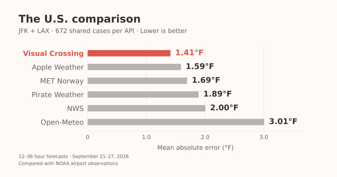
On the 672 shared JFK and LAX cases, Visual Crossing had the lowest average error at 1.41°F. NWS averaged 2.00°F.
NWS is still worth evaluating for a U.S. product. Its public API is free and includes forecasts, alerts, and observations. This particular result covers two airports in one week. It doesn’t establish how NWS compares across the country.
Was Pirate Weather Consistent?
Pirate Weather had the lowest average temperature error on all seven capture dates.
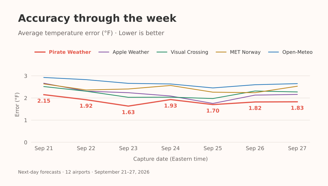
It also led in each forecast window: 1–12, 12–36, and 36–60 hours. Each window uses different shared forecast hours.
Temperature is only one part of a forecast. The comparison explorer also has wind-speed results, scored separately in m/s or mph. Wind observations describe a short reporting period, while provider forecast definitions can differ.
Hourly Rain at Heathrow Was Nearly Tied
I also checked the saved rain amounts against NOAA’s measured precipitation at London Heathrow, matching the same one-hour periods for five sources. This is a smaller comparison than the temperature study: 139 recorded hours, including 16 with measurable rain. I left missing and trace amounts out.
Visual Crossing had the lowest error during rainy hours, but the difference was tiny. All five averaged about 0.044 inches of error per rainy hour. There isn’t enough here to pick a general rain winner.
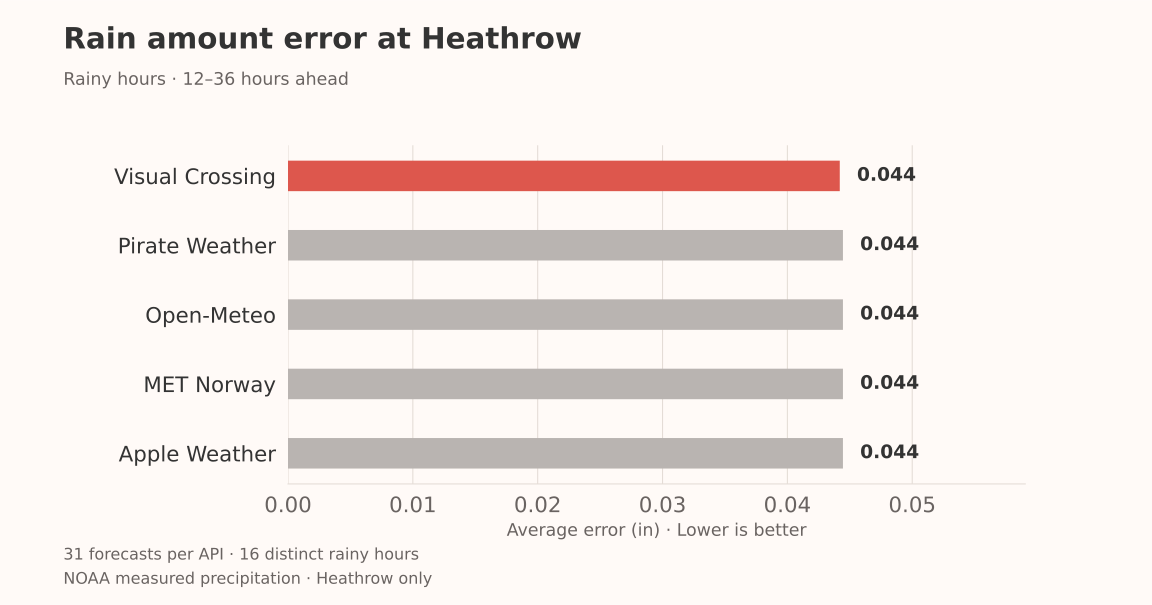
Including dry hours brought the average errors down to about 0.005 inches, with Visual Crossing and MET Norway tied for the lowest error. That’s why I showed rainy hours separately: dry weather can make a rain forecast look better than it is. All five sources underestimated the rain during the matched rainy hours.
NWS’s saved forecasts had rain chances but no amounts, so it isn’t included here.
These are liquid-equivalent precipitation amounts. I haven’t ranked rain probabilities or minute-by-minute rain timing, and the Heathrow results don’t tell us which source is best for rain everywhere. You can compare both sets of rain scores and download the data.
Which API Predicted Rainfall Best?
Apple Weather was most accurate for rainfall amount at JFK, with an average error of 0.11 inches per 24-hour total.
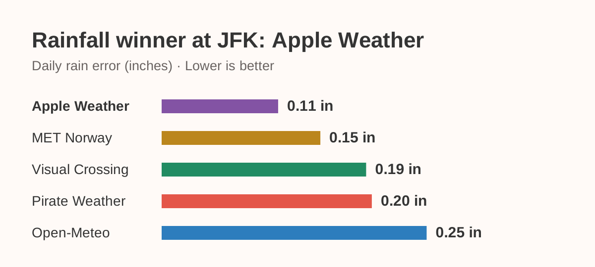
I compared the saved forecasts with JFK’s measured rainfall over seven 24-hour periods, September 22–29. Each API had 14 forecasts, saved roughly 12 or 24 hours before the period began. All five used the same days: four wet and three dry. Apple Weather also led when I scored only the wet days.
The reference was JFK’s ASOS rainfall reports. I checked the daily totals against the hourly reports and aligned each API’s rainfall hours to the measured period. I adjusted the partial hours at each boundary by their duration. Missing measurements weren’t counted as dry weather.
This is a JFK-only result, not a rain ranking across all 12 airports. Two forecasts for the same day aren’t separate rain events. It compares amounts, not rain probability or start time. The saved NWS forecasts didn’t include rainfall amounts. You can download the rainfall scores and method.
What I’d Look at When Choosing an API
For a global forecast app, I’d start by testing Pirate Weather against my own locations. It had the lowest pooled temperature error here, and its Dark Sky-compatible interface is useful for existing integrations.
For a U.S. app, or a product that also needs historical weather, I’d include Visual Crossing on the shortlist. The local results at JFK and LAX were strong, and its Timeline API covers historical weather and forecasts.
WeatherKit is a practical candidate for Apple apps and also has a REST API. Its access and attribution requirements are part of the decision. MET Norway and Open-Meteo both had locations where they led, so I wouldn’t dismiss them based on the pooled chart. Check MET Norway’s usage guidelines and Open-Meteo’s commercial plans for the product you’re building.
Then I’d work through four questions:
- Does it perform well where my users are? Collect a longer comparison at those locations.
- Does it supply the data I need? Rain timing, alerts, historical data, and forecast horizon deserve their own checks.
- What will a complete refresh cost? Count the required endpoints, returned records, traffic peaks, and permitted caching.
- Can I use and keep the data the way my product needs? Displaying a forecast, archiving it, and redistributing it can have different terms.
What This Experiment Can’t Answer
One week at twelve airports doesn’t settle which provider is most accurate everywhere. I haven’t tested seasonal performance, unusual weather events, every API configuration, or individual models available through Open-Meteo. These scores are descriptive, without a statistical significance claim.
Forecasts can share underlying weather models, nearby hours are correlated, and METAR temperatures are often rounded. Airport wind measurements also won’t describe every street or backyard. Small differences deserve some restraint.
I build a weather product, and these are the sources I already work with. My goal is to make the comparison useful enough that you can inspect the evidence and decide what to test next.
The interactive comparison includes airport results, matched forecast counts, signed bias, and request timings. You can also download the aggregate CSV. Collection has ended. The results use the observation archive frozen at September 30, 2026, 14:10 UTC.